Leading Mobile & web Development company which is providing Ready to publish apps & on demands application in Global Bussiness.
- 908, B Square 2, Ambli Rd, near Hotel Double tree Hilton, Vikram NagarAhmedabad-380054, Gujarat, India
- (+91) 8758432204Give us a call
- contact@initiotechmedia.com24/7 online support

A responsive design masterclass in Flutter
- payal patel
- April 26, 2023
- 0

If you’re a developer new to Flutter, chances are you’ve struggled to get your app to look great on different devices and screen sizes. It’s a common challenge for developers starting out with Flutter, and it’s something that takes time and practice to master.
Don’t worry – you’re not alone! In this blog post, we’re going to take a deep dive into the world of responsive design in Flutter, and we’ll provide you with all the tips, tricks and tools you need to build apps that look and function seamlessly on a variety of devices. Whether you’re just starting out with Flutter or you’re an experienced developer looking to brush up your skills, this blog post has something for you. So let’s get started!
My first Flutter project — a lack of responsiveness!
When I was certain enough about my Flutter skills, I was determined to create my first real app. I spent countless hours coding and debugging, putting a lot of time and energy into the project. When I finally finished, I was proud of how everything fit together. I couldn’t wait to share my app with the world, to show what I was able to make. So I published it and eagerly let my family download it during a family dinner. But to my dismay, the app was a complete mess on other devices. There were overflow errors everywhere. I was so confused and ashamed at that time. How was it possible that it all looked so perfect on my device but so poorly on other devices? After some investigation, I realized that I had made a critical mistake. I had focused so much on making my app look perfect on my own device that I had ignored the importance of responsive design.
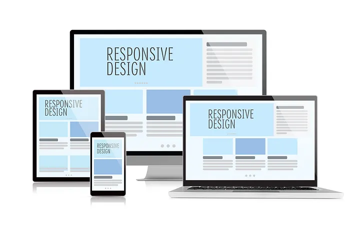
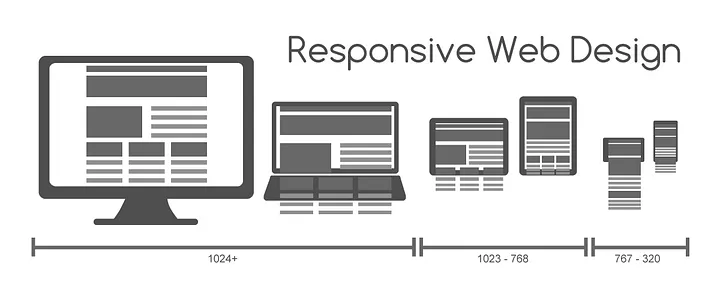
So what is responsive design?

- Tags:
- Flutter
- Flutter 2.0
- flutter 2023
- Flutter 3.0
- Flutter advance
- Flutter App developer
- Flutter app development
- flutter architechture
- Flutter bloc
- flutter developer
- Flutter development
- Flutter Libraries
- flutter machine learning
- flutter test
- Flutter Tips
- Flutter Ui
- Flutter Widget
- Hire flutter developers
- IOS
- mobile app development
- Mobile app with AI
- Mobile app with AI #AR
WhatsApp us

